Human-Centric Web Design Trends for 2026: Warmth and Authenticity Over Minimalism
The web design pendulum has swung hard. After a decade of flat design, ultra-minimal interfaces, and increasingly similar-looking SaaS landing pages, 2026 is the year designers are actively pushing back toward warmth, texture, and human imperfection. If you build themes or ship production sites, this is not just an aesthetic trend — it changes how you approach layout systems, component libraries, typography choices, and even performance budgets.
This guide is for front-end developers and theme authors who need to understand what is actually shifting in client expectations and user behaviour, not just what looks good on Dribbble. We will cover the practical implementation side: what these trends mean for your CSS, your design tokens, and your template architecture.
What Changed and Why It Matters
The backlash against sterile minimalism has been building since 2024, but 2026 is where it became impossible to ignore. Users have developed banner blindness for the "hero section with gradient background and sans-serif headline" pattern. Conversion data from multiple A/B testing platforms shows that warmer, more distinctive designs are outperforming cookie-cutter templates — not by tiny margins, but by 15–25% on engagement metrics.
Three forces are driving this:
- AI-generated content flooded the web with sameness. When every site can generate a clean layout in minutes, clean layouts stop differentiating anything. Distinctiveness now requires intentional design choices that resist automation.
- Users are fatigued by interfaces that feel disposable. The "everything looks like a Bootstrap template" era trained users to skim and bounce. Sites that feel crafted hold attention longer.
- Brand teams realised minimal does not mean memorable. The same companies that stripped their logos down to geometric sans-serifs in 2020 are now reintroducing texture, illustration, and typographic personality.
Warmth as a Design System Property
Warmth is not a vague aesthetic — it is a set of measurable design decisions you can encode in your theme tokens.
Colour Temperature
The shift is away from pure whites and cool greys toward warm neutrals. In practice, this means your background tokens change from #ffffff and #f5f5f5 to something closer to #faf8f5 or #f5f0e8. Your text colour moves from #000000 or #333333 to warmer darks like #1a1a1a or #2d2926.
This is not subtle. Side-by-side, a warm palette feels approachable and a cool palette feels corporate. The shift is small in hex values but large in emotional response.
Typography Choices
2026 is the year variable fonts went from "nice to have" to essential. Designers are pairing serif headings with humanist sans-serif body text, using optical sizing to maintain readability at every scale. The typography and readability guide covers the mechanics of type scales and line height — the trend layer on top of that is a return to typefaces with visible personality.
Concrete examples: Inter is being replaced by faces like Instrument Serif, Sentient, or Fraunces for headings. Body text is moving toward humanist designs like Source Serif 4 or Literata that have warmth without sacrificing screen legibility.
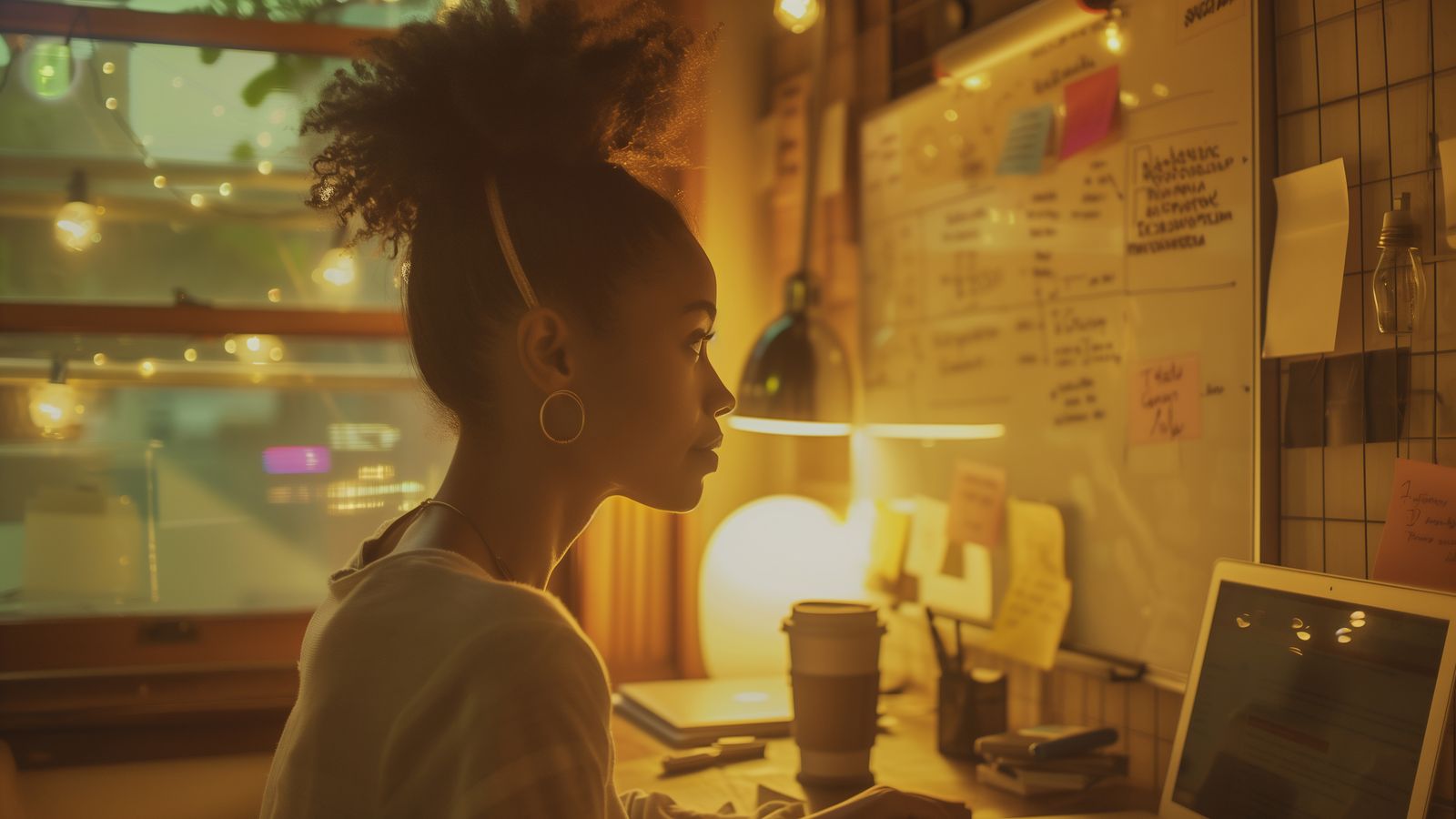
Texture and Materiality
Backgrounds with subtle paper texture, grain overlays, or soft shadows that suggest physical depth. This is the most visible part of the trend but also the easiest to overdo. The implementation that works: a single subtle texture layer at low opacity (3–8%) applied to your main background, combined with soft box shadows that use warm-toned rgba values instead of pure black.
What does not work: layering multiple textures, using high-contrast grain, or applying paper effects to every component. That reads as a Tumblr theme from 2012, not a modern warm design.
Layout Implications
Human-centric design changes layout priorities. The grid-obsessed, pixel-perfect alignment of previous years relaxes slightly in favour of layouts that feel organic.
Asymmetry With Purpose
Strictly symmetrical grids are giving way to layouts with intentional asymmetry — wider left columns, offset images, pull quotes that break the text measure. This is not the same as broken-grid design from 2018. The difference is that modern asymmetry maintains a clear reading flow while introducing visual interest.
In CSS terms, this means more use of named grid areas with unequal column widths, fewer 1fr 1fr 1fr patterns, and more deliberate use of negative space on one side of a layout.
Generous Whitespace, Different Distribution
Minimal design used whitespace uniformly. Human-centric design uses it asymmetrically — more space around key content, tighter groupings for related elements. The semantic HTML layouts guide covers the structural side of content grouping. The visual layer in 2026 is about making those semantic groups feel like natural clusters rather than rigid boxes.
Component Borders and Containment
Hard-edged cards with uniform borders are being replaced by softer containment strategies: subtle background tints, gentle shadows, or simply spatial grouping without explicit borders. If your theme system relies heavily on .card components with border: 1px solid, consider adding variants that use background differentiation or shadow-only containment.
Performance Considerations
Warm design can be heavier than minimalism. Textures add bytes. Custom fonts add requests. Illustrations add payload. The cache and performance guide covers the technical strategies — here is what matters for this specific trend:
- Texture images should be tiny. A repeating grain texture can be 2–5KB as a small tiled JPEG. Do not use a full-viewport texture image.
- Variable fonts pay for themselves. One variable font file replaces 4–6 static font files. The weight savings offset the slight increase in individual file size.
- SVG illustrations compress well. Hand-drawn style SVG elements often compress to under 3KB each. They add warmth without meaningful performance cost.
Budget carefully. A warm, textured design that loads in 2.8 seconds loses the engagement gains from its aesthetics. The target is still sub-2.5 seconds for Largest Contentful Paint on mobile.
Implementation Checklist
- [ ] Background tokens use warm neutrals, not pure white or cool grey
- [ ] Text colour tokens use warm darks, not pure black
- [ ] Heading typeface has visible personality (serif or distinctive humanist sans)
- [ ] Body typeface optimised for screen readability at warm colour temperatures
- [ ] Texture overlay (if used) is subtle — under 8% opacity, small repeating tile
- [ ] Box shadows use warm-toned rgba (e.g.,
rgba(45, 41, 38, 0.08)) not pure black - [ ] Card components have a soft containment variant alongside bordered variant
- [ ] Layout grid includes at least one asymmetric option
- [ ] Variable font loading uses
font-display: swap - [ ] Total page weight increase from warm design elements stays under 50KB
- [ ] Largest Contentful Paint remains under 2.5 seconds on mobile
Mistakes to Avoid
Confusing warmth with nostalgia. This trend is not about making sites look retro. It is about making them feel human. A site can be warm and thoroughly modern. Avoid skeuomorphic textures, faux-leather patterns, or stitched borders — those read as costume rather than character.
Inconsistent application. Warm backgrounds with cold UI components (bright blue buttons, sharp-cornered modals, system sans-serif in form fields) creates visual dissonance. The warm palette needs to extend through interactive elements and micro-interactions, not just the hero section.
Ignoring accessibility. Warm colour palettes can reduce contrast ratios if you are not careful. A #1a1a1a text on #f5f0e8 background passes WCAG AA easily, but lighter warm tones for secondary text can drop below the 4.5:1 threshold. Check every combination.
Texture on text. Background textures behind body text reduce readability. Apply textures to page-level backgrounds, not to content containers. The text area itself should remain clean.
What This Means for Theme Authors
If you are building themes — for WordPress, for static site generators, for any CMS — the practical takeaway is that your design token layer needs to support warm and cool modes. Do not hardcode warm values throughout your CSS. Instead, structure your tokens so the entire temperature of the design can shift by updating a small set of root variables.
A well-structured theme.json or CSS custom property system lets you offer warm and cool variants without duplicating component styles. That is the architectural advantage of treating warmth as a system property rather than a scattered collection of one-off colour values.
Field-Tested Observations
Warm design increases time on page but not always conversion. We have seen consistent 10–20% increases in session duration on warm redesigns, but conversion impact depends heavily on the call-to-action design. Warm aesthetics can make aggressive CTAs feel out of place. The CTA design needs to shift too.
Clients initially resist warmth because it feels less "professional." This is changing fast, but expect pushback from stakeholders used to corporate blue-and-white. The data helps. Show them engagement comparisons.
Print designers adapt to this trend faster than digital-native designers. The concepts of paper texture, typographic warmth, and material quality are native to print design. If your team includes someone with a print background, leverage that knowledge.
FAQ
Is this trend just a backlash cycle that will reverse? Partially, yes. Design trends are cyclical. But the underlying driver — AI making generic design trivially easy — is permanent. The premium on distinctiveness and human craft will persist even if specific aesthetic choices evolve.
How do I apply this to an existing minimal design without a full redesign? Start with colour temperature. Shift your background and text tokens toward warmer values. Then update your heading typeface. Those two changes alone shift the feel significantly without touching layout or component code.
Does warm design work for B2B SaaS? Yes, and arguably it is more impactful there because the category is saturated with identical cold designs. The differentiation value is highest where sameness is most extreme.
Next Steps
- Review the typography and readability guide for type scale implementation
- Explore the layout demos to see how different structural approaches handle content
- Check the semantic HTML layouts guide for accessible structure under any visual treatment
- Browse all guides for more practical front-end implementation patterns